Otto House — Turning rigid templates into editorial product experiences
Reframing a premium real-estate platform around narrative, conversion and content autonomy.

Client
Otto House
My Contribution
- UX strategy
- User research
- Information architecture
- Visual design
- Prototyping
- Design system
Timeline
2022
Team
- 1 Product Designer
- 2 Software Engineers
- 1 Product Manager
Beachfront penthouses, historic mansions, private condos — each with a distinct personality. Yet they all looked the same online.
The team felt it first. Weeks curating a property's story, only to watch it vanish into a generic layout. Every update blocked by a developer ticket.
The challenge: turn a rigid template into an editorial experience that lets each property feel like itself.
• Templates erased identity. A $2M property looked the same as a $200K one. The more unique the listing, the more it got flattened.
• Content froze. Every update needed a developer. A 5-minute edit meant a 2-day ticket.
• Users hit dead ends. Browsing felt like a directory — no momentum, no pull. Contact required effort. Most left.

The property detail page was the core — it holds everything and drives view, contact, share. Behavioral data gave us a starting point: users scanned listings top-to-bottom and dropped off around the facts block, before ever reaching the contact action. But numbers don't tell you what someone feels landing on a listing.
I started with a CSD Canvas to map certainties, assumptions, and doubts — then split the ambiguity in two: the team's publishing pain (structural, measurable) and the buyer's emotional dead end (felt, harder to name).
• What the data showed: users lingered on narrative content, not spec tables — the least structured listings held attention longest.
• What the audit showed: no premium platform solved both brand and conversion — each optimized one at the expense of the other.
• What I still assumed: that editors would trade flexibility for guidance once they felt the result. De-risked it by prototyping the component system with the actual team before committing.
I audited 12 platforms — QuintoAndar, Sotheby's, AxPe, Casas Bacanas — to map UX failures in high-end real estate. Two failure patterns repeated: performance-first platforms made premium properties feel like commodity listings, while brand-first platforms buried the actions buyers need. The landscape was fragmented — almost none did both.
| Decision | Rejected | Chosen | Why |
|---|---|---|---|
| Navigation | Filter-heavy search | Curated, editorial browsing | Premium audiences respond to discovery, not filtering — the audit showed filter-heavy platforms all read as commodity |
| Content hierarchy | Feature-first listings | Narrative-first, emotional hierarchy | Trust is built through story, not specs — behavioral data showed users lingered on narrative blocks |
| Visual density | Rich visual effects | Minimalist, image-led layout | Properties, not UI, should capture attention — speed signals credibility in real estate |
• The CMS tension. The team needed freedom to tell stories — but every story had to look on-brand. Too much flexibility would break the identity; too much control would kill the voice. I built a component system with guided layouts — structured enough to stay consistent, open enough to feel unique.
• Performance as trust. In real estate, speed signals credibility. A slow page makes buyers doubt the professionalism behind it. I set performance budgets before writing a single line of CSS.
Clear navigation, property pages that blend facts with feeling. Each property breathes while still guiding users toward action.
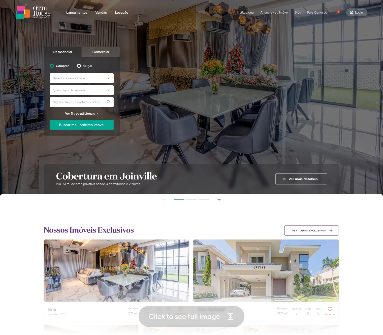
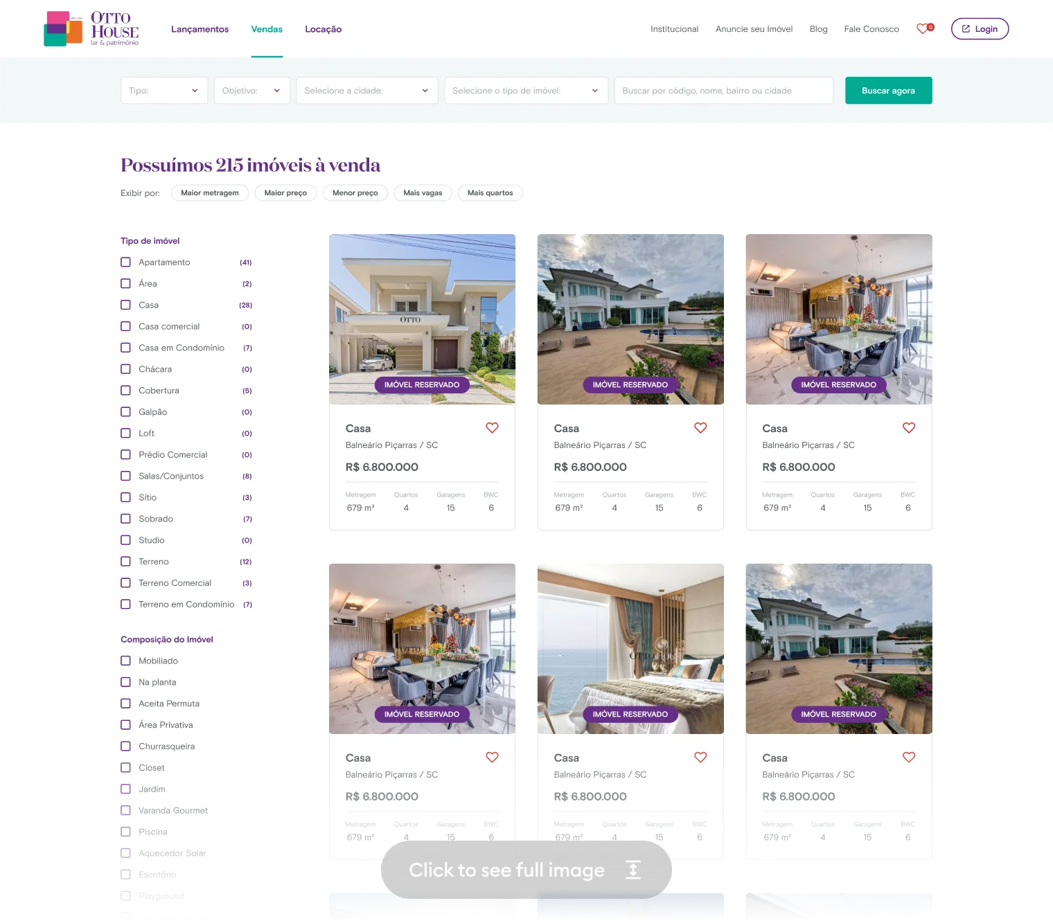
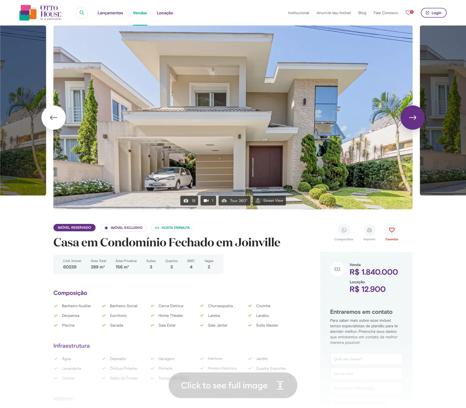
I owned product design end-to-end: discovery, IA, visual direction, and the component system. The bet on narrative-first over feature-first — and the refusal of rich visual effects — was mine to make and mine to defend against stakeholder pressure. The PM owned roadmap and business alignment; the engineers owned CMS architecture and front-end implementation. The line where editor freedom meets brand control — the guided component layouts — was my call.
What I shipped: A complete editorial platform — curated browsing, narrative-first property pages, a component-based CMS, and an image-led design system. One platform replacing rigid templates with per-property storytelling.
The hardest call: browsing vs. filtering. Editorial navigation matched the brand, but I underestimated how much buyers rely on structured filters. Earlier quantitative testing would have saved cycles.
Otto House confirmed: design leadership means translating brand into structure — aligning emotion and action at every touch.