Designing a self-service kiosk experience
68% faster check-in · 87% self-service completion · 74% lower receptionist workload
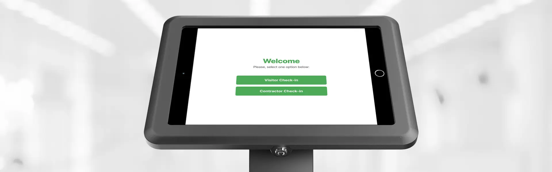
Client
ecoPortal
My Contribution
- Product strategy
- UX research
- Interaction design
- Visual design
- High-fidelity prototyping
Timeline
2025
Platform
1024×768 touchscreen kiosk
The manual check-in process created operational bottlenecks, increased receptionist workload, and slowed visitor access. A visitor arrives for a meeting, stands at a kiosk — and freezes. A contractor late for a job is forced through a long registration — again.
The challenge: reduce operational friction while preserving security, compliance, and a seamless experience — on a shared public device with low digital literacy users.
• Anxious first-timers. Visitors and new contractors freeze at the kiosk — unsure where to tap, afraid of making mistakes.
• Forced repetition. Returning contractors re-register and re-complete training every visit — wasting time and creating frustration.
• Invisible confirmation. No visible host notification — users don't know if the process worked, leading to anxiety and queues.
| Category | Constraint | Design Implication |
|---|---|---|
| Technical | Fixed 1024×768, touchscreen, white-label, offline fallback | One action per screen, large touch targets, no network reliance |
| User | Low digital literacy, time pressure, anxiety, one-time users | Progressive disclosure, simple language, forgiving validation |
| Business | Compliance, shared device, multiple profiles, existing workflow | Security validation, audit trail, reception integration |
I started on-site: shadowing receptionists through peak hours, watching first-time visitors freeze at the kiosk, and timing contractor re-registrations. I benchmarked three kiosk categories — airports, hospitals, coworkings — for interaction patterns and failure states.
• What I learned: the biggest risk wasn't the interface — it was uncertainty. Users abandoned when they couldn't tell if the process had worked.
• What I assumed: that email-based recognition would cover returning contractors without new infrastructure. De-risked it with inline validation in the prototype before build.
Each decision represents a deliberate trade-off between user value, business impact, and technical feasibility.
| Decision | Rejected | Chosen | Why |
|---|---|---|---|
| Flow structure | Single flow for all users | Branching flows by user type | Visitors and contractors have fundamentally different needs — confirmed on-site: contractors carry compliance pressure, visitors carry anxiety |
| Returning users | Full registration each visit | Email-based recognition with inline validation | Returning contractors save time, no extra infrastructure — shadowing showed re-registration was the most hated moment |
| Training format | Long text with a single checkbox | Modular checkboxes with acknowledgments | Verifiable items increase comprehension and compliance — long text was skipped entirely on-site |
| Confirmation | Subtle success message | Strong completion state with host notification | Higher confidence, reduced support requests — uncertainty was the #1 abandonment trigger observed |
Balancing speed, compliance, and accessibility on a fixed kiosk meant three constraints shaped every design decision.
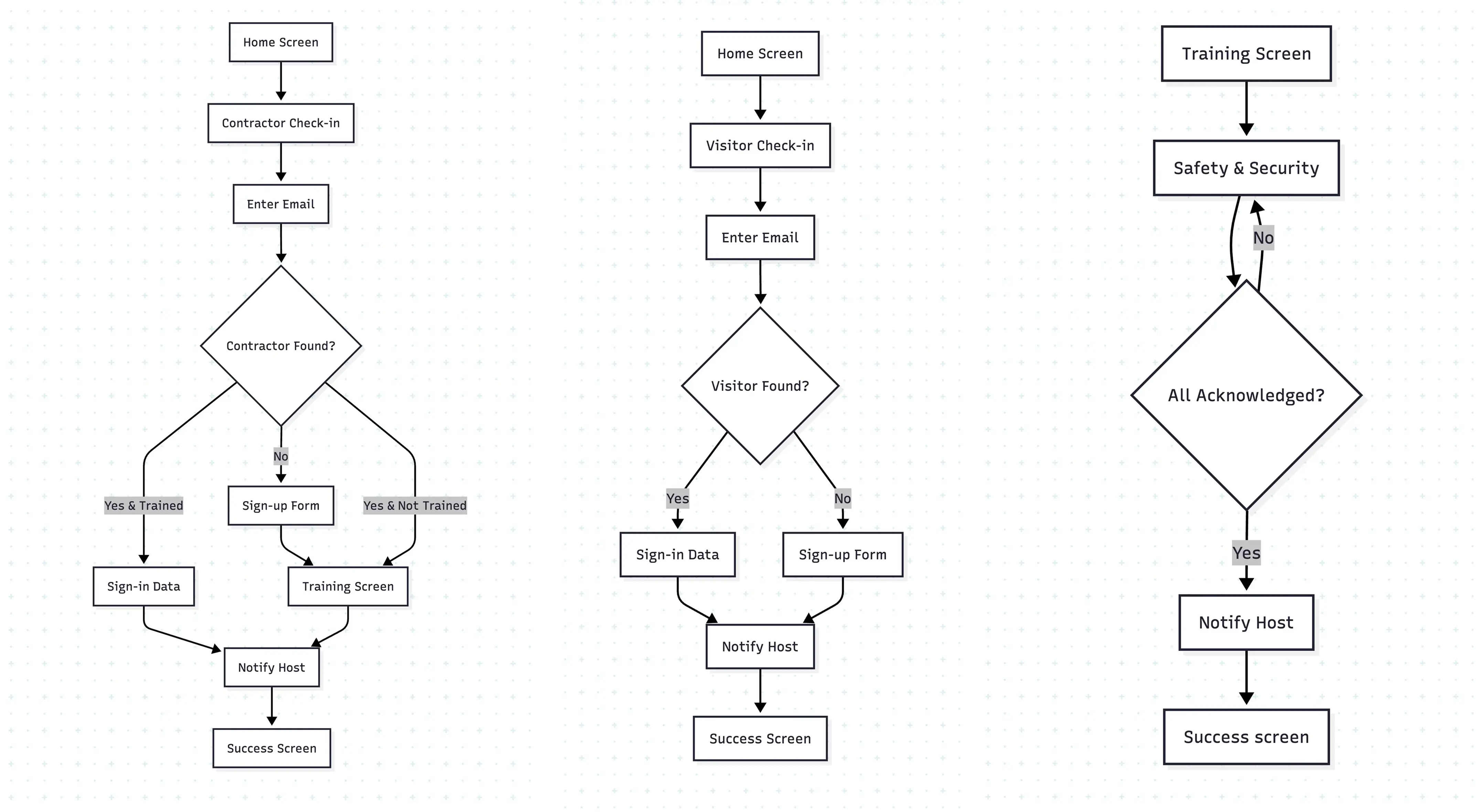
A streamlined kiosk flow combining speed, compliance, and clarity in a single touchscreen interface.
• Visitors complete check-in in under a minute — select their role, enter contact details, and receive immediate confirmation that their host has been notified.
• Contractors follow a dedicated path that detects returning users, validates training status, and enforces safety compliance without unnecessary repetition.
• Claude. Synthesized competitive benchmarking data from 3 kiosk categories (airports, hospitals, coworkings) into design patterns and risk areas.
• ChatGPT. Generated UX copy variants for kiosk prompts and error messages, tested for clarity across low digital literacy users.
I owned the kiosk experience end-to-end: research, interaction design, visual design, and high-fidelity prototyping. The branching flows, the returning-user recognition, and the strong completion states were my calls — each defended against the easier "single flow for everyone" path. The engineering team owned the offline fallback and device integration; I validated every interaction against the 1024×768 constraint.
What I shipped: Complete kiosk experience — branching user flows, email-based returning contractor detection, modular safety training, offline fallback, and a 1024×768-optimized interface serving diverse digital literacy levels.
I'd test with actual kiosk hardware earlier. Screen glare, touch responsiveness, and reading distance changed a lot of assumptions that looked fine in Figma.
Biggest lesson: designing for anxiety. Clear progress indicators, immediate confirmation, and forgiving input validation aren't nice-to-haves — they're the core of the experience.